Aug 19, 2026Pet Business Guides
Why Doesn't the Same Pantone Color Look the Same on Every Pet Product Material?
Why can one Pantone color look different across a harness, leash and hardware? Learn how brands should manage color matching before OEM production.
Why Doesn't the Same Pantone Color Look the Same on Every Pet Product Material?
I have had this conversation during product development many times.
A brand sends one Pantone color and asks us to use it across an entire walking collection.
On the design file, everything looks perfectly coordinated:
Harness.
Collar.
Leash.
Webbing.
Metal hardware.
Rubber logo.
Packaging.
Then the physical materials arrive.
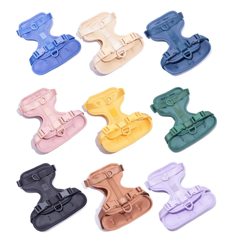
The polyester fabric looks slightly warmer. The webbing looks darker. The coated metal looks different again. Take the products outdoors, and a beige that looked neutral under indoor lighting may suddenly show a pink or yellow undertone.
The natural reaction is:
“But we used the same color. Why don't they match?”
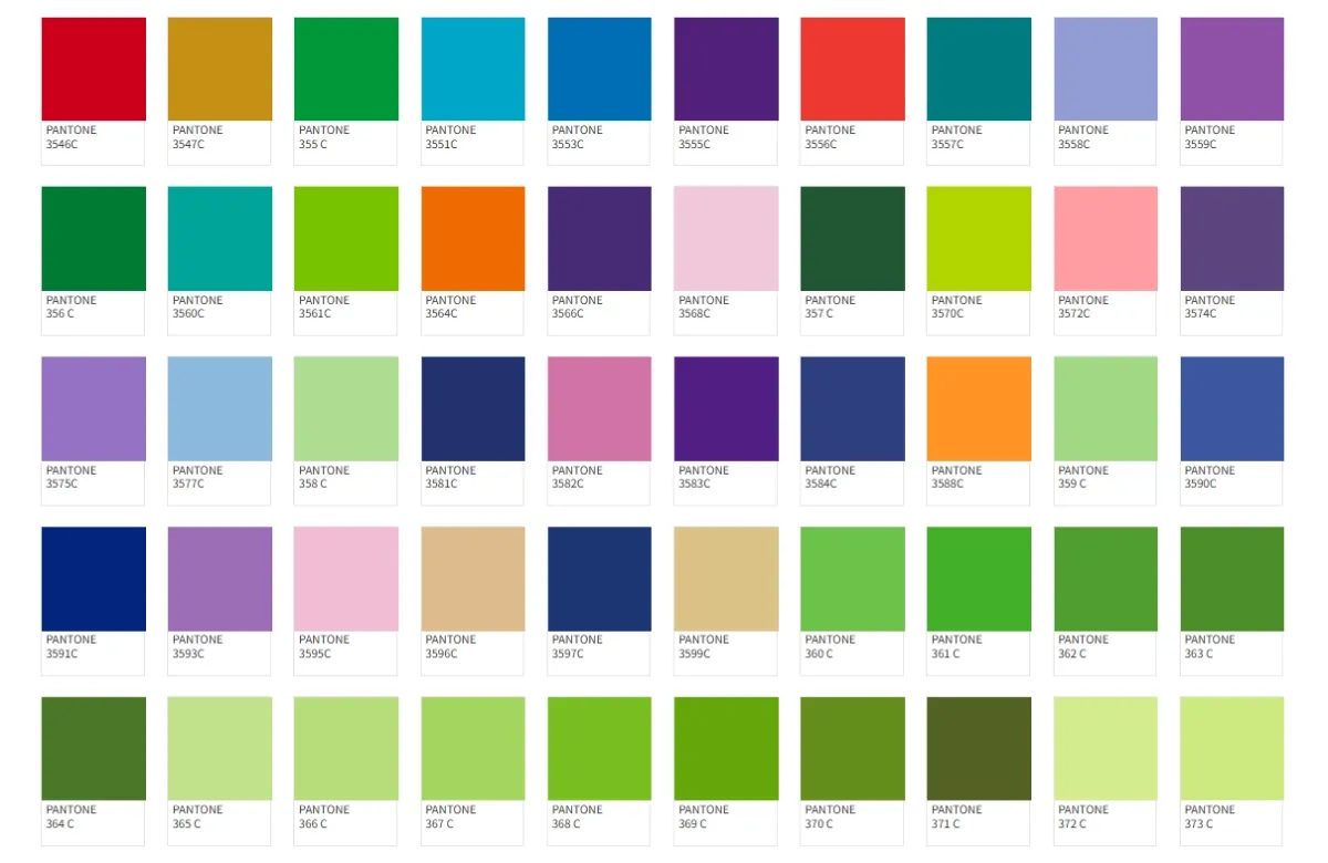
The short answer is that Pantone gives brands a color target, not a guarantee that different materials and manufacturing processes will produce an identical visual result. Fabric composition, surface texture, dyeing, printing, coating and lighting can all change how the same target color is perceived.
For private label pet brands, the solution is not simply to send a Pantone number.
The solution is to build a color approval process into product development before mass production.
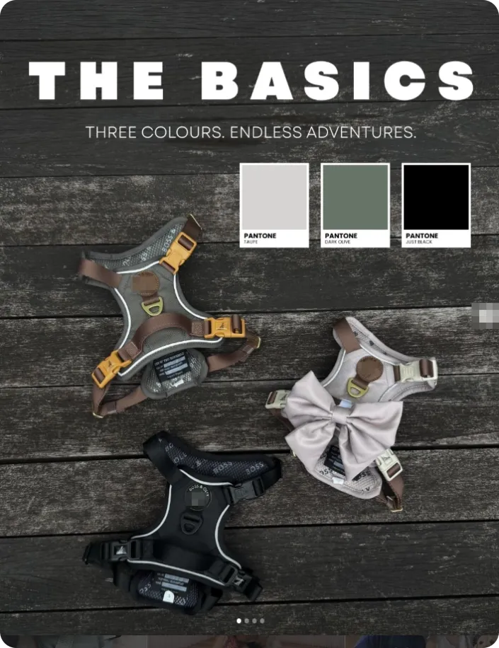
1. Why Can One Pantone Color Look Different on Fabric, Webbing and Hardware?
A digital product rendering makes color matching look deceptively simple.
Select one color.
Apply it to every component.
Done.
Physical manufacturing does not work like that.
The Material Changes How We See Color
Imagine developing a dusty rose walking collection.
The same target color might appear on:
Component | Material / Process | Why Appearance Can Change |
|---|---|---|
Harness shell | Polyester fabric | Weave and surface texture affect light |
Inner layer | Air mesh | Open structure changes visual density |
Leash | Nylon/polyester webbing | Different fiber and weave |
Logo | Silicone/rubber | Smooth surface reflects light differently |
D-ring | Coated metal | Gloss and metallic base affect appearance |
Packaging | Printed paper | Ink and paper base change the result |
Even before manufacturing tolerance is considered, these surfaces interact with light differently.
A matte fabric absorbs and scatters light.
A glossy coated buckle reflects it.
A textured webbing creates tiny highlights and shadows.
So two components can be technically close in color measurement but still look different when placed beside each other.
Dyeing and Printing Are Not the Same Process
Another common misunderstanding is assuming every colored component is produced in the same way.
It is not.
A fabric may be dyed.
A printed harness panel may use sublimation.
Webbing may be yarn-dyed or piece-dyed.
A metal buckle may use plating or coating.
A logo may use molded colored material.
Each production process has its own variables.
This is why the instruction:
“Please make everything Pantone 14-XXXX.”
is a useful starting point—but not a complete production specification.
2. Should Pet Brands Use Pantone, Digital Artwork or Physical Samples?
Ideally, brands should understand the role of all three.
They solve different problems.
Digital Artwork Is Good for Design Direction
Artwork helps suppliers understand:
- Overall palette
- Color relationships
- Pattern
- Branding
- Product appearance
But screens are unreliable color standards.
A designer's monitor, a buyer's laptop and a supplier's phone can display the same file differently.
Brightness settings make the problem even worse.
If exact color is important, approving production only from an image sent through email or WhatsApp creates unnecessary risk.
Pantone Gives Everyone a Common Reference
A Pantone reference is much better than saying:
“light beige”
or:
“make it like the picture.”
It gives the brand, material supplier and manufacturer a common target.
But the target still needs to be translated onto the actual material.
That leads to the most useful approval method.
Physical Material Samples Show the Real Result
For color-sensitive collections, the most important approval may be the actual material sample.
For example:
Custom-dyed webbing → physical webbing swatch.
Printed fabric → strike-off or printed material sample.
Coated hardware → actual finish sample.
Once approved, those physical references can become part of the production standard.
The hierarchy is therefore often:
Digital concept → Pantone target → Physical material approval → Production standard
Not simply:
Pantone → Production.
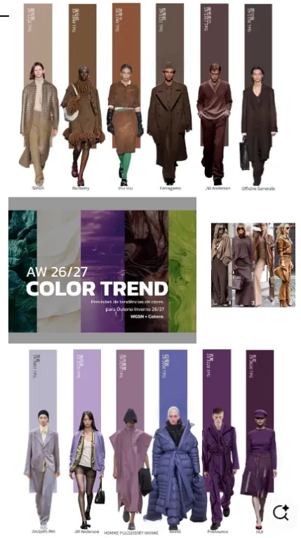
3. Why Does Lighting Cause So Many Color Disputes?
This is one of the easiest color problems to underestimate.
A material can look correct in the factory and noticeably different outdoors.
Why?
Because color perception depends on the light illuminating the object.
Indoor Light and Daylight Are Different
Factories, offices, retail stores and outdoor environments may use completely different light sources.
A warm indoor lamp can make beige appear more yellow.
Cool lighting may make it appear more grey.
Natural daylight can reveal undertones that were difficult to notice indoors.
This becomes particularly important with colors such as:
- Beige
- Cream
- Grey
- Taupe
- Dusty pink
- Sage
- Lavender
Small undertone differences can change the character of the entire collection.
This Is Why Brands Should Review Important Colors in More Than One Condition
For a signature brand color, I would not rely on one photograph.
Review the physical sample where possible.
Look at it:
- Under normal indoor lighting
- Near daylight
- Beside the other collection materials
The third point is especially important.
A webbing color may look perfectly acceptable by itself.
Put it beside the harness fabric and suddenly the difference becomes obvious.
Color approval should therefore consider the collection, not only individual components.
4. How Should Brands Manage Color Across a Complete Walking Collection?
The first step is deciding what actually needs to match.
This sounds obvious, but it can save a great deal of unnecessary development work.
Exact Matching Is Not Always Necessary
Consider a premium green collection.
Does the green metal buckle need to be visually identical to the green fabric?
Maybe.
But perhaps a deliberate tonal difference looks better.
For example:
Sage fabric + darker green webbing + gold hardware.
Now the colors are intentionally coordinated rather than unsuccessfully trying to be identical.
This can be easier to manufacture and visually stronger.
Decide Which Color Is the Master
If the brand has one signature color, choose the component that matters most.
For a harness-led collection, the main harness fabric might become the master reference.
Other materials are then matched to the approved fabric, rather than independently matched to the same digital file.
This creates a more practical visual standard.
Approve Materials Together
Before mass production, place the key components together:
Main fabric.
Mesh.
Webbing.
Logo.
Hardware.
Packaging if color coordination matters.
Then ask:
Does this look like one collection?
That is often a more commercially useful question than:
Are all five materials mathematically identical?
A Practical Color Approval Process for Private Label Pet Products
For a custom collection, the process can look like this:
Stage | Brand Decision | Supplier Action |
Concept | Select palette | Review feasibility |
Color target | Provide Pantone | Source/match materials |
Material sampling | Review swatches | Adjust where necessary |
Product sample | Review complete combination | Build final sample |
Approval | Confirm acceptable standard | Lock production references |
Bulk production | — | Control against approved references |
The exact process depends on the project.
A stock product with an existing color obviously needs much less development.
A fully custom collection using several dyed components needs more.
The important point is that color has a development cost.
That cost may involve material sampling, minimum dye quantities, additional lead time and sometimes multiple attempts.
What Happens When a Brand Wants an Exact Custom Color at a Low Quantity?
This is where color development and MOQ meet.
A brand may request:
100 harnesses in an exact custom Pantone.
But the harness manufacturer does not manufacture the fabric itself.
The fabric supplier may require a larger minimum dye quantity.
The webbing supplier may have another MOQ.
The hardware coating supplier may have another.
This explains why a finished-product MOQ and a custom-color MOQ are not always the same thing.
For smaller launches, brands can consider three strategies.
1. Use an Existing Material Color
Fastest and usually lowest risk.
The product can still be differentiated through branding, embroidery, packaging or hardware.
2. Choose the Closest Existing Color
If the brand palette has some flexibility, an existing supplier color may be commercially close enough.
3. Develop the Exact Custom Color
Best suited to signature products or volumes that justify the material development.
There is no universally correct option.
The right choice depends on how important that exact color is to the brand.
When Is Exact Color Matching Worth the Cost?
Not every product needs the same level of color control.
A signature harness collection built around a recognizable brand palette may justify additional sampling.
A secondary accessory being tested in small quantities may not.
I would evaluate three questions:
Is this color central to the brand identity?
Will multiple products need to coordinate with it?
Will the product be reordered often enough to justify establishing a custom standard?
If all three answers are yes, investing in proper color development makes sense.
If not, an existing material color may provide a better balance between differentiation and sourcing flexibility.
Why Color Problems Become More Expensive After Production Starts
Color is easiest to fix when it is still a material swatch.
Suppose a custom fabric costs more than expected to reproduce.
Before production, the brand can still decide:
Accept it.
Adjust it.
Choose another material.
Change the design.
After 1,000 harnesses are sewn, those options become much more expensive.
This is a general sourcing principle:
Approve the problem at the cheapest possible stage.
Color → approve material.
Fit → approve sample.
Packaging → approve artwork/sample.
Production → inspect workmanship.
Waiting until finished goods to make a material decision is usually too late.
How JABARI PET Approaches Custom Color Development
At JABARI PET, we work with pet brands, retailers and Amazon sellers developing private label harnesses, collars, leashes, apparel and related accessories.
Color matching can be part of the development process, especially when a brand wants a coordinated collection.
Depending on the product, this may include:
- Pantone references
- Existing material color selection
- Custom material sourcing
- Printed fabric sampling
- Webbing matching
- Hardware finish coordination
- Physical sample approval
- Bulk material confirmation
One thing we try to clarify early is which colors need to be exact and which simply need to coordinate well.
That distinction matters.
Trying to force every different material into an identical appearance can add cost and development time without necessarily creating a better product.
Sometimes the more professional solution is controlled tonal coordination.
Final Answer: Pantone Is the Starting Point, Not the Final Approval
So why doesn't one Pantone color look identical across a harness, collar, leash and hardware?
Because color does not exist independently of material.
The final appearance is influenced by:
Color target + material + surface + manufacturing process + lighting.
Pantone gives the supply chain a common language.
Physical samples tell you what that language looks like on the actual product.
For pet brands developing a signature collection, the strongest process is therefore:
Define the color → provide a reference → sample the real materials → compare them together → approve a physical standard → start production.
And there is one final question worth asking before spending weeks chasing an exact match:
Does the customer need these materials to be identical—or do they need them to look intentionally good together?
Those are not always the same thing.
Understanding the difference can make private label pet product development faster, more predictable and commercially smarter.